
What do you get when Oli and the Unbounce team shows up at Inbound.org to answer all questions for multiple hours?
You get an epic AMA and a clinic in SaaS copywriting, conversion rate optimization and landing page optimization.
This post covers some of my favourite tidbits and expands on some of their stellar answers.
Oli Gardner’s Epic Tweets
Full disclosure: this was my question and it nabbed me a slick Unbounce T-Shirt. I challenged Oli to generate an epic tweet that would lead marketers and copywriters to landing page riches. He went above and beyond and gave three epic tweets worth chatting about.
If you ever send campaign traffic to your homepage I’ll hunt you down & change all your passwords so you can never access the internet again
That’s Oli for your home page and landing pages are two very different beasts and he’ll cut your access to the internet if you EVER confuse the two.
Think about the home pages you come across. They don’t try particularly hard to keep you there. In fact, they often encourage you to visit their friends – the features, pricing, and blog pages.
Home pages encourage exploration because they don’t know who you are, how you got here, how much you know about the product, etc. They’re hoping that by making exploration easy, you’ll find the info you need to sign up or buy.
Landing pages are the exact opposite.
Landing pages know exactly where you’ve come from, they have a good idea of who you are, and they know what you’re looking for. So, to help you get the thing you want/need ASAP, landing pages strip away navigation and other distractions to help you do exactly one thing. That one thing could be downloading an e-book, signing up for a newsletter, or making a purchase.
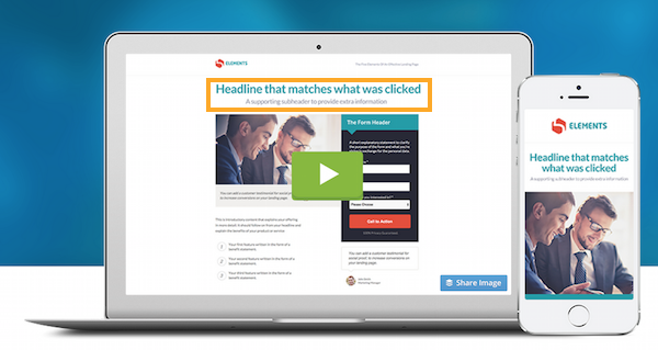
Look how Unbounce’s landing page guides the visitor along an efficient path to the CTA. They’ll reach the CTA quickly and with enough information to know that they should click through.
So, people should arrive at your home page from a Google search, by typing your url into the address bar, or by clicking a link from another page on your main site.
Your landing page should be getting traffic from pay-per-click (PPC) ads, social media ads, and other targeted forms of traffic getting. People don’t typically stumble upon landing pages.
NSAMCWADLP. Never. Start. A. Marketing. Campaign. Without. A. Dedicated. Landing. Page.
Bonus points! This is true and the acronym doesn’t sacrifice clarity by trying to make it spell something (personal pet peeve). Related to what I said above, if you’re going to send targeted traffic somewhere, you best be sending it to a landing page (or else Oli…).
Copy informs design, not the other way around. Write your campaign copy first, then design an experience to communicate it visually.
I almost cried tears of joy when I read this from Oli himself. If you’re in the business of copywriting, you’ve inevitably met a [bad] designer that thinks they should create the website layout first and then have you plug in some copy afterwards. You’ve heard this before, “So… make sure the benefits description is four lines long otherwise it messes the alignment up.” Ugh… No!
This goes for copy edits on your web pages and landing pages too. You don’t edit the copy so that the layout can remain the same. You edit the copy so that it’s as persuasive as possible, and then you design the web page to further clarify the message.
Message Matching is a Match Made in Heaven
Ryan Engley said:
My biggest takeaway from Oli Gardner has been Message Match. Working with our customers, it’s one of the biggest opportunities that marketers miss out on, and often one of the most significant ways to reduce bounce rate, improve time on page and ultimately, improve conversion.
Message Matching refers to creating continuity for your target from the beginning of the campaign to the very end and everywhere in between with your copy and visuals.
Look at this example from Unbounce:
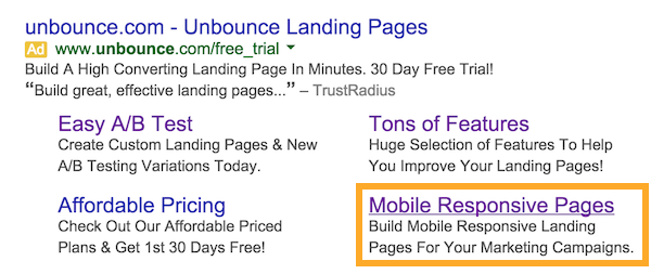
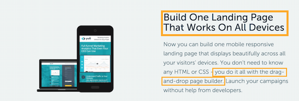
After searching “Unbounce” and clicking “Mobile Responsive Pages,” I DID NOT get taken to Unbounce’s home page. Instead, they did a perfect job of Message Matching:
See how this landing page’s headline plays off the text in the ad I clicked? This whole page is about the benefits associated with mobile responsive landing page creation. I can’t click to a blog or an FAQ page.
I can:
- Try Unbounce
- Close this browser tab
- Or click the back button
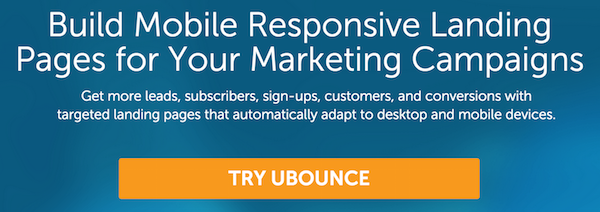
That’s it. Unbounce forces you to make a decision.
And here, they are just showing off:
Not only is Unbounce Message Matching with copy – they’re doing it with visuals too. The visuals on this page all match the concept of responsive landing pages.
Then, like the cheeky bas%^rds they are, the headline in the video is about Message Matching! It’s as if they knew this post was coming…
Joanna Wiebe’s Message Mining Copywriting Hack
Carter Gilchrist said:
Using your customers’ words directly to speak to more customers is such a powerful tool. I find myself doing this when we launch new features in the product — I’ll go back to old community posts from customers originally requesting the feature or describing their problems and pull out quotes to use in the launch messaging.
I agree, Carter, this is a biggy. Not only is it more effective than any snappy buzzword infested copy you could dream up in a vacuum – the bulk of the work is done for you.
Basically, Message Mining is all about going to the places where your target hangs out and chats about the thing your copy talks about. Then, rather than write “salesy” copy you “created,” you borrow (re: steal) exact phrases your target has used. This method can be extended to phone interviews, in-person interviews, open ended survey questions etc.
You can just record these phrases in an organized Google Spreadsheet. Low-tech, but it works.
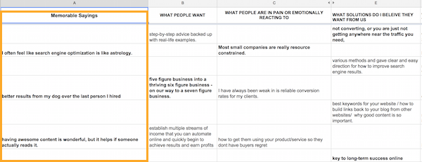
If you want a free copy of Joanna’s message mining spreadsheet, you can get it here.
The goal is to make your copy sound like your target’s subconscious and NOT like something out of a door-to-door sales person’s mouth.
It’s pretty self-explanatory, but I highly recommend checking out Joanna’s post on message mining.
Emails, Like Landing Pages, Should Have ONE Purpose Each
Georgiana Laudi said:
Its just always come down to thinking of our emails the same way we do landing pages — one page (or email in this case, duh) one purpose.
Check out this email from Ryan at Unbounce on the importance of mobile responsiveness. It’s 100% focused on giving me just enough information to make me click that button with solid button copy.
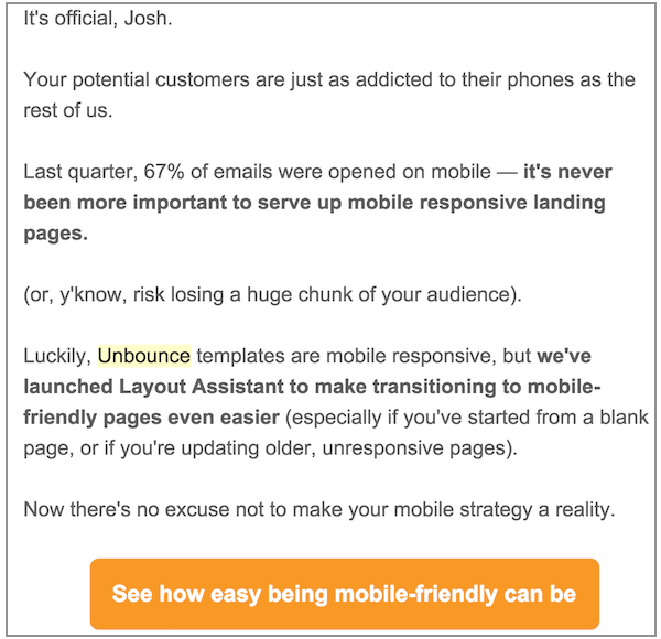
Unless the email is a newsletter, your email shouldn’t be littered with a bunch of links. Instead, your email should be persuading the reader to click a single clickable CTA by telling them what they’ll get (benefits) and removing any anxiety.
As a rule, we try to provide enough information that someone would need in order to click the call-to-action. No more, no less. It works well for us.
Notice she isn’t saying that your email copy needs to be long or short. It needs to be exactly long enough to get them to click the CTA.
A number of factors can help you determine the ideal length of your email such as where they are in your sales funnel, how complicated your offer is to understand, and whether your ask is a big one (buy now) or a small one (get this awesome e-book for free).
Oli Gardner on Call-to-Actions (CTA) and Sign Up Forms
Oli said:
What is pretty common (and successful) is to have a simple CTA at the top or throughout your landing page (particularly long ones) which smooth scroll down to a form at the end of the page. That helps remove it from the immediate view and lets you write a persuasive CTA without the fear of the form.
and…
Popping the form up when you click is a decent strategy too, but I wouldn’t hide it any more than one click away.
He’s saying that rather than having multiple forms in plain view on your landing page, try just having a button that scrolls you down to a form at the bottom of the page when clicked. Forms can be scary after all.
Every Landing Page Needs These 5 Things
- Hero shot
- Headline & subhead
- Features & benefits
- Social proof and
- Call to action
Hero shot
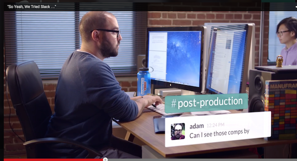
Your Hero Shot is a visual representation of your offering being used. It needs to be the most dominant visual on the page (image or video), and it needs to help your visitor understand how they’ll use the product and benefit from it.
I recommend checking out Slack’s video as it’s a genius montage of hero shots.
Headline and subhead
I won’t insult your intelligence. The headline is the first thing the user sees when they land on your landing page. Writing great headlines is the topic of many posts. Often, the headline’s importance is exaggerated slightly. Instead of thinking about your headline as an isolated and sacred thing, think about your headline and CTA button copy together.
Subhead text just supports any claims or promises made in your headline.
The subhead copy is often clearer and better suited for headline status. Too many headlines are more clever than clear. Then, the subhead tries to clarify the terrible headline by using plain language and being specific. If this sounds familiar, try swapping your headline and subhead.
Features and benefits
While features probably need to be on your landing page in some capacity, you’re going to want to focus on the benefits. That is, lead with the benefit and then use features to support your benefits. A rookie would lead with “Drag and drop page builder” and then hide the benefits in the body copy. Not good.
Social Proof
All is not lost if you can’t get social proof of this calibre.
Try getting someone notable in your niche to use your product and say something positive about it. Specifics are your friend here.
Don’t have them say:
“Unbounce is the best landing page software, ever.”
Instead, have them say something like:
“With Unbounce’s templates, we upped our conversion rate by 30% compared to when we used their [competitor].”
Getting them to give you specifics isn’t about fabricating fake testimonials. It’s about asking specific questions that require a detailed answer.
It’s:
“So, what did you think of Unbounce?”
v.s.
“Did switching to Unbounce lift conversion rates? If so, by how much?”
You can also report sheer numbers here in addition to or instead of a testimonial from a specific person. This only works when the numbers are big enough to convince your target that “everybody’s doing it.”
Ease last minute anxieties – show them that notable people/companies and/or large numbers of people just like them have done what you want them to do and are glad they did.
Call-to-Action
Scroll down beyond the end of this post and you’ll see an example of a CTA. ;)
And, if you liked this post, I’m calling on you to act on that CTA to get more content like this directly to your inbox.