

Heads exploded in Las Vegas when Joanna Wiebe, of Copy Hackers fame, took the stage and started throwing SaaS copywriting wisdom bombs out into the crowd for us to catch and use in our own bag o’ tricks.
Her 3 secret moves are:
- Make headline and button copy work together & manage expectations
- Give everything exactly 1 job to do
- Making you, a founder or copywriter, understand that you don’t know sh*t – your customers have the answers.
Today, I’ll unpack the first of those tricks – the amazing thing that happens (more conversions) when headlines and buttons play off of one another and expectations are managed appropriately. Then, we’ll finish up with examples from companies you know like Quick Sprout, Bounce Exchange, and Unbounce.
Headline and Button Copy = ❤️
Joanna has seen hayoooge quantitative lifts (like a 123.9% lift) in conversion by making headlines and buttons play nice with one another.
Doing this makes the prospect’s journey so simple a lizard could do it. When it’s this simple, the lizard can just react (click) by flicking its tongue out and chomping on that fly (getting the thing they want).
I’ll show ya what I mean while we take a stroll along an old Parisian road in search of the best espresso.
Your headline makes a promise
 Imagine you’re sauntering down a cobbled stone road in ol’ Paris on a quest to taste the finest espresso. A couple of baguettes later, you stumble upon a chalkboard that says, “Looking for the best espresso in Paris? Step inside.” with an arrow pointing to a door.
Your headline is just like this sign. It’s your way of saying to your prospect, “Hey, you know how you’re looking for xyz SaaS solution? It’s here.”
Your CTA button is the door in between the promise & the thing promised
Now imagine you follow the arrow to find a door that looks like many doors you’ve seen before. There’s no windows to peer through – you can’t see what’s on the other side. Is the best espresso on the other side of this door? Is this place even a cafe at all? You have your doubts.
Doubts = Friction = Missed Opportunities.
This is the real-world version of the “Submit,” “Send,” “Signup,” and other ambiguous buttons. You’re not 100% sure whether you’re going to immediately get what the headline promised. There’s a disconnect between them. So, unless you’re super-motivated, you won’t click to find out and you’ll move along to a competitor that messages clearly.
 Now, imagine the door is a glorious pop of red on an otherwise conservative street. On it are the words, “Come in and taste the best espresso in Paris!” There’s a window with a screen and you can see and hear people enjoying their caffeinated treats. Heck, you can even smell the sweet aroma. You know you’re walking through this door!
The door is playing off the street sign. The button is playing off the headline. That button needs to stand out and make it perfectly clear that on the other side is the thing you want – all ya gotta do is click.
And the thing you promised better be right on the other side of the button!
You walk through the door, step up to the counter with your French dictionary in hand, and order the best espresso in Paris. Finally!
The barista says, “Oui, of course, monsieur,” and spits out a few more words. You flip through your dictionary and think he said something about juggling – but that can’t be right. You look up wearing a puzzled expression and sure enough, he’s got 3 bowling pins in one hand while twiddling his mustache with the other.
You’re pissed off, right? You read the sign, followed the arrow, opened the door and approached the counter to get the best espresso in Paris – not to juggle for the mustached barista and then get your espresso – maybe! The trust is gone and you’re not sure you’ll get the espresso even if you juggle like a champ.
When you write a headline that makes a promise and create a button that ensures the headline’s promise is just a click away – that thing needs to be exactly one click away. Don’t make your prospects juggle. Otherwise, change the headline and button copy to manage expectations appropriately.
Capiche?
I highly recommend checking out Joanna’s post on this topic where she shows how she got that 123.9% lift in clicks by making her headlines and button copy work together.
Headline & Button Copywriting Rock Stars
So let’s take a gander at some copywriting that nails the headline + button copy + managing expectations trifecta. I’ll also comment on the copy since it’s awesome and we’re here anyway.
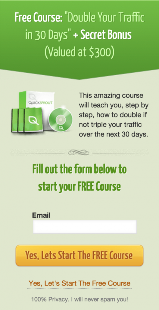
Quick Sprout
 Let’s first look at a handful of general copywriting things Quick Sprout is doing really well…
- The headline starts with the magic word, which isn’t “Please” but rather “Free.”
- It promises a specific deliverable (2x traffic) in a specific amount of time (30 days).
- It includes a secret bonus. What could it be? I don’t know, but I’m dying to find out. AKA I’m signing up.
- It’s free, but it’s valued at $300. What a bargoon!
- The sub-headline copy tells me that if I don’t double my traffic, it’s because I’m tripling it. Yes, please.
And the headline and button copy is bang on, too.
This is all about starting a free course, right? Before they ask for your email, they reiterate their offer – FREE course.
You fill in your email because why wouldn’t you, and the button does not say, “Submit,” but rather, “Yes, Lets Start The FREE Course” – once again making it clear that you’re getting something substantial (a course) for FREE.
I signed up for the course because I’m interested but also because I wanted to see if the Quick Sprout family would try to make me juggle after they got what they wanted from me.
They didn’t.
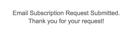
The only thing I’d suggest is lightening up this “Request Submitted” copy a little bit. Such personable copy all over Quick Sprout and then I feel duped because this default robot copy is the prize at the finish line. It’s kind of like, “Now that we got what we wanted, we can stop pretending to be your pal.”
Bounce Exchange
Want to see some advanced ninja-guru-wizard-insert magical creature-like moves? Check out Bounce Exchange’s approach.
After you watch their home run of a product video and your mouth is watering and your pupils have transformed into dollar signs, they go for the jugular starting with this…
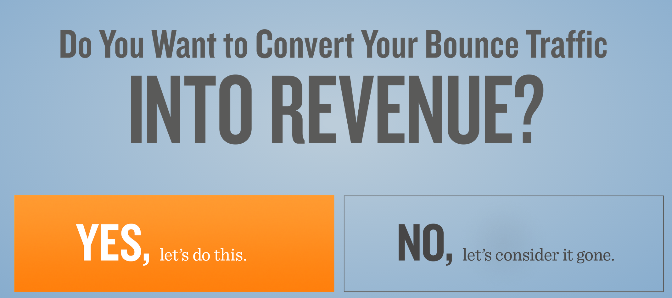
The headline asks the same question you’re trying to find a solution to if you sat through the entire video. They also increase the size of the copy that contains the thing you want more of – revenue.
The buttons act as answers to the headline question. Either you want to convert bounce traffic into revenue or you’d prefer to move along and say goodbye to that money. The question is redundant by design.
Bounce Exchange does something awesome here in addition to making the button copy play nice with the headline. The button they want you to click is orange, awesome, and on the left. The “No” button is what is called a ghost button – it’s less visible and on the right. Your eyes are obviously drawn to the Yes button.
Side note: don’t use ghost buttons for buttons you hope prospects click. It’s fashionable, looks pretty, but doesn’t often convert like old-school buttons that stand out. If you just gotta use ’em, at least A/B test with traditional CTA buttons.
Next, they ask for your website url and email address to see if you qualify for a demo. Qualify for a demo?! Bounce Exchange isn’t some $50/month solution that everyone is a good candidate for. It’s a SaaS solution with superpowers that starts at $5995/month – so yeah, not everyone is worth doing a demo for, but anyone who qualifies will require a demo before making a purchase this big.
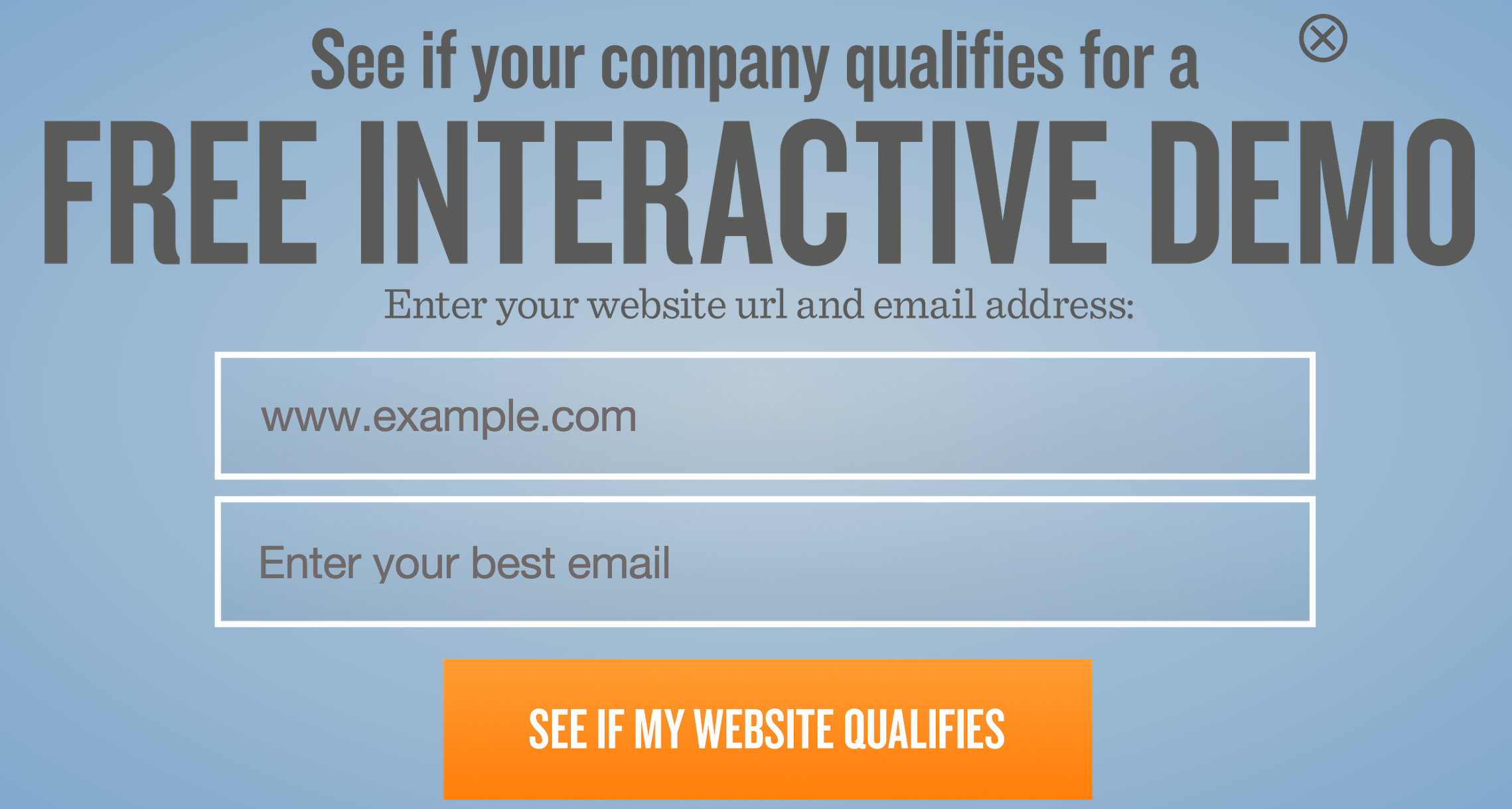
The headline and button copy plays nice again. The button copy actually mimics the headline, which Joanna from Copy Hackers says is a fine strategy indeed.
The next step is again very clever…

The headline and button copy work well together – not surprising by now. Both are chalk full of action words. This step is all about encouraging you to give up your contact info by reinforcing the main value proposition – converting bounce traffic.
They do a few things to increase the likelihood that you give your contact info:
- They ask you to “jot down your details below.” That is a lot less intimidating than something like, “Provide your contact information below.” We’re protective of our contact information – but I’d jot down my details.
- They include the email field which was already completed in the previous step. It reminds you that you’ve already given contact information and so it’s not a big deal to give a little more. It also makes you want to complete this section – just 3 fields to go!
- They don’t tell you that the telephone number field is optional. If required fields were marked and the phone number one didn’t have the little asterisk, a lot of people wouldn’t fill it in since this is guarded information. I hate sales phone calls! For those that aren’t willing to give it up here (me), they’ll try to submit without giving their number and they’ll succeed. But, I bet they get some numbers from prospects that would have left it empty if it were labeled as optional.
One little beef I have is that they say this is the final step even though it isn’t. There’s one more short step.
The final step asks you to disclose the range in which your revenue falls so that they can match you up with the appropriate conversion team.
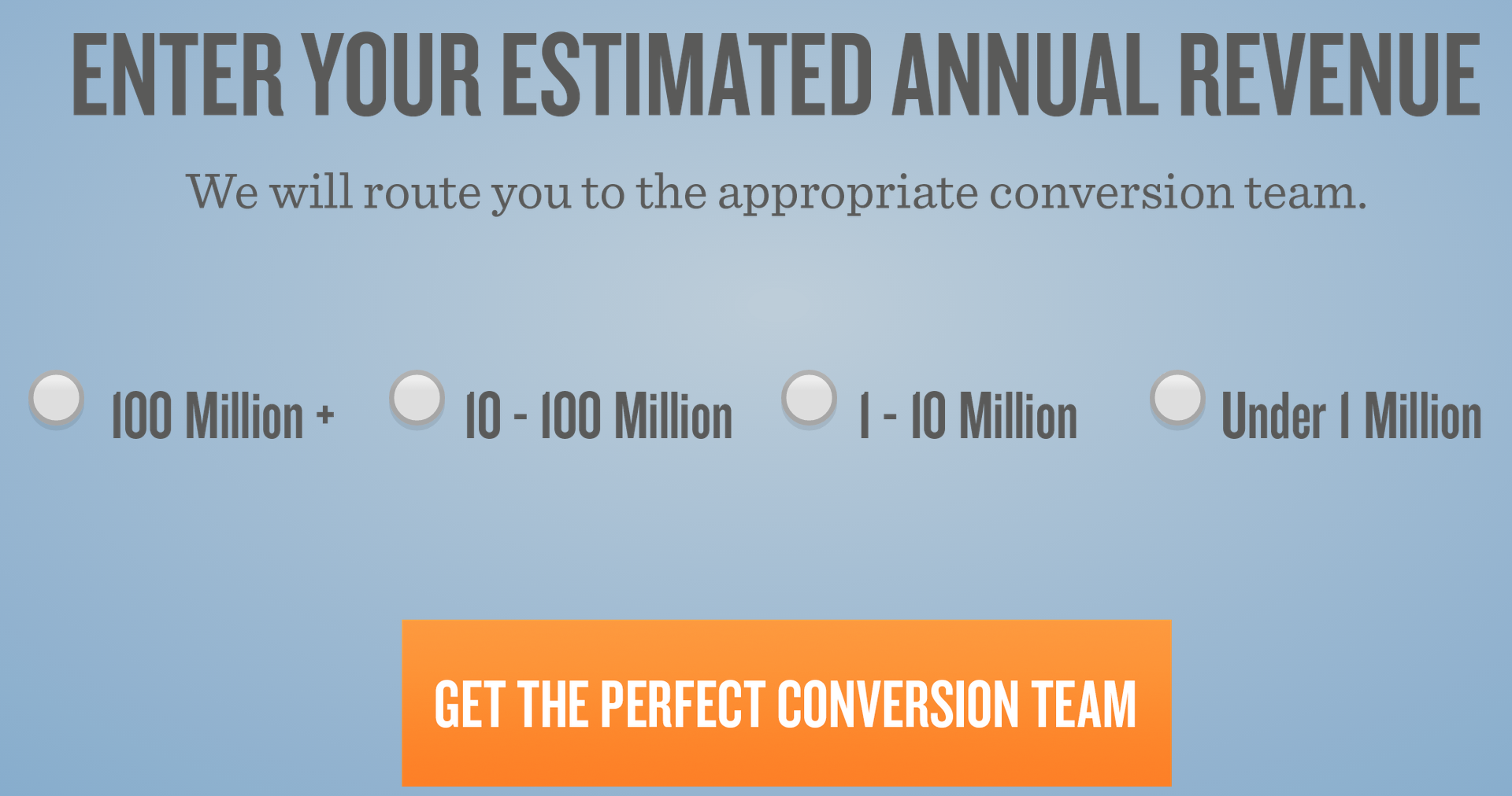
This is information you want to keep close to your chest when it comes purchase negotiations, right? The objection, “I just can’t afford this, what can you do for me?” becomes a lot less convincing when you’ve already clicked the $10-100 Million in revenue button prior to talking to the sales rep!
So, to get it out of you, they help you understand that gathering this information is for your own benefit, and it is. Bounce Exchange hooks you up with a conversion team.
But, without the sub-headline copy that says, “We will route you to the appropriate conversion team,” this request seems selfish. This copy acknowledges the fact that different sized companies have different conversion problems, and these different problems require unique skill sets.
And if it wasn’t clear that they’re just trying to help, the button copy drives it home by saying, “Get the perfect conversion team.” You’re getting something here… not giving something.
The genius at work here is obvious when you look at the entire exchange. I always felt like I was being listened to because the copy spoke to my struggles. Really, I was giving up my:
- Website url
- Business email address
- First and last name
- Probably my phone number and preferred method of contact
- Annual revenue
They got all of this stuff without even giving me a free course, a white paper, or a free trial – blasphemy!
Their sales cycle for this expensive solution is shortened significantly. They will know who I am, what I’m currently doing on my website that’s leading to my conversion problems, and they’ll know my approximate budget and get the sales rep on the phone that has the best chance of selling to someone like me.
Unbounce – an exception to the rule?
I’m going to be honest and say that while the headline and button copy is in line throughout this signup process, I didn’t feel my expectations were managed appropriately.
I also know that Oli and the Unbounce team are of the conversion elite and they’ve come to this signup flow after rigorous testing. I’m guessing conversion doesn’t drop off, even though they dangle the carrot until they get what they want, because Unbounce is a highly regarded landing page solution and visitors are super-motivated to give it a try. Creating obstacles might even help filter out the tire kickers, therefore improving lead quality. Just a guess.
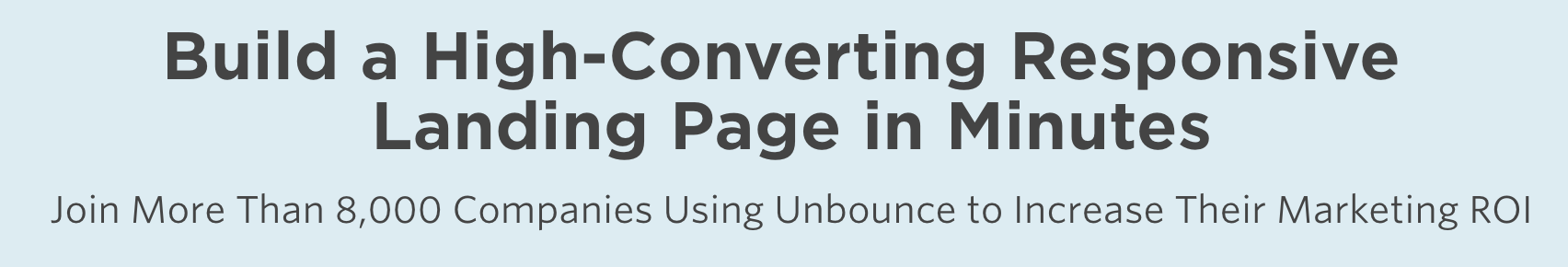
On their home page, the headline tells me I can build, publish, and test landing pages without coding. Awesome – of course I want to be able to do that.

The button sweetens the deal by saying that I can start building these high-converting pages “Now.” The graphic below the button shows me that right after I click the button and build this page that I can build now, I can publish and start optimizing it.
Except I don’t get to build this landing page now…
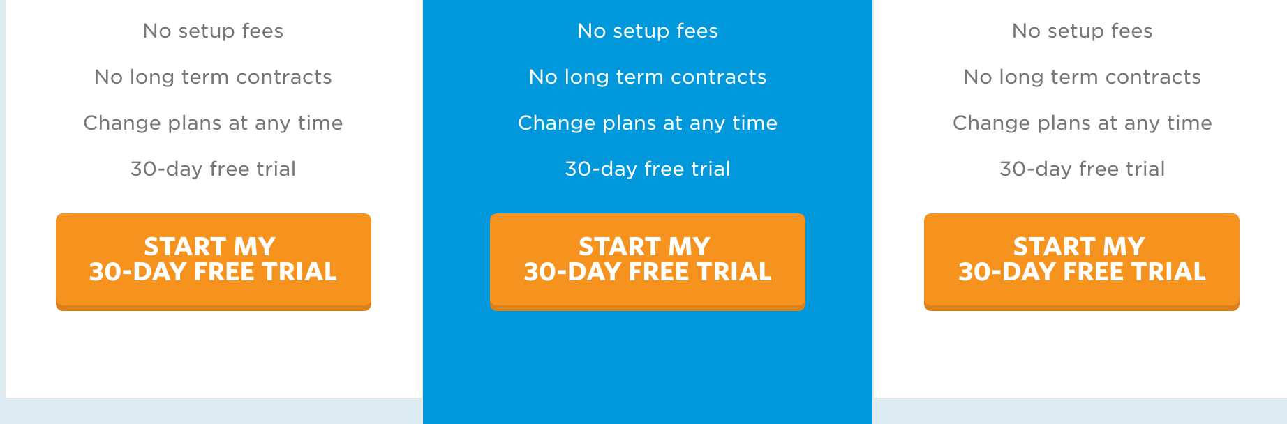
Clicking the button takes me to their pricing page where I can choose the appropriate 30-day trial.
Ok, I forgive you. It makes sense that not everyone tries the full-featured Unbounce when there’s no way they’ll be purchasing the most expensive plan.
So I chose the $99 plan and was sent to this typical signup form. I fill in the fields and click the button to start my free trial.
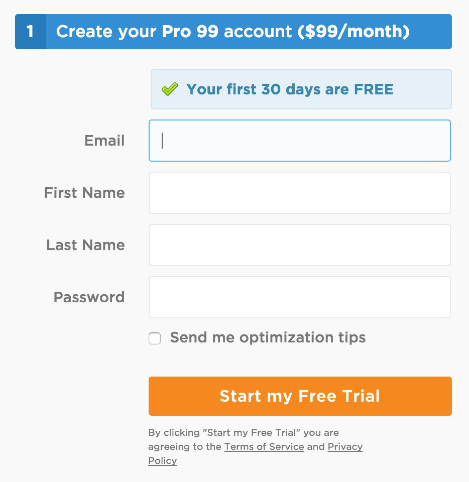
Except I don’t get to start. Now, I have to fill out my billing information.
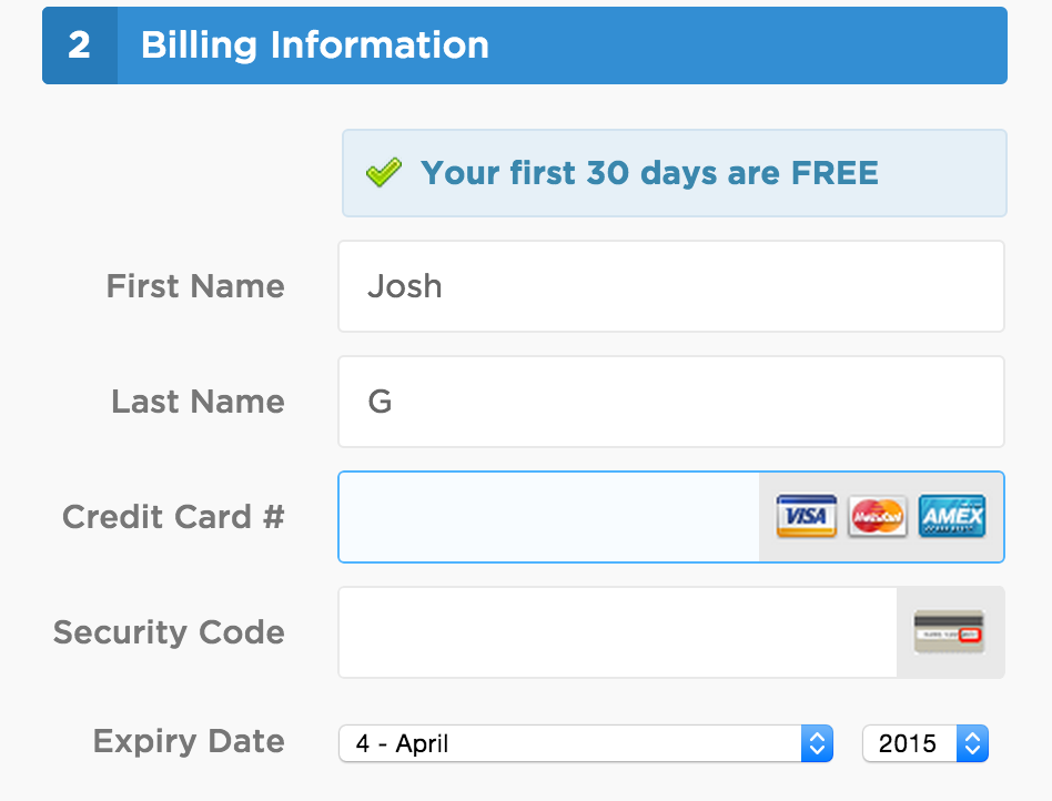
I thought I was going to start building landing pages a few steps ago, and now I find myself not building landing pages but giving up credit card info instead.
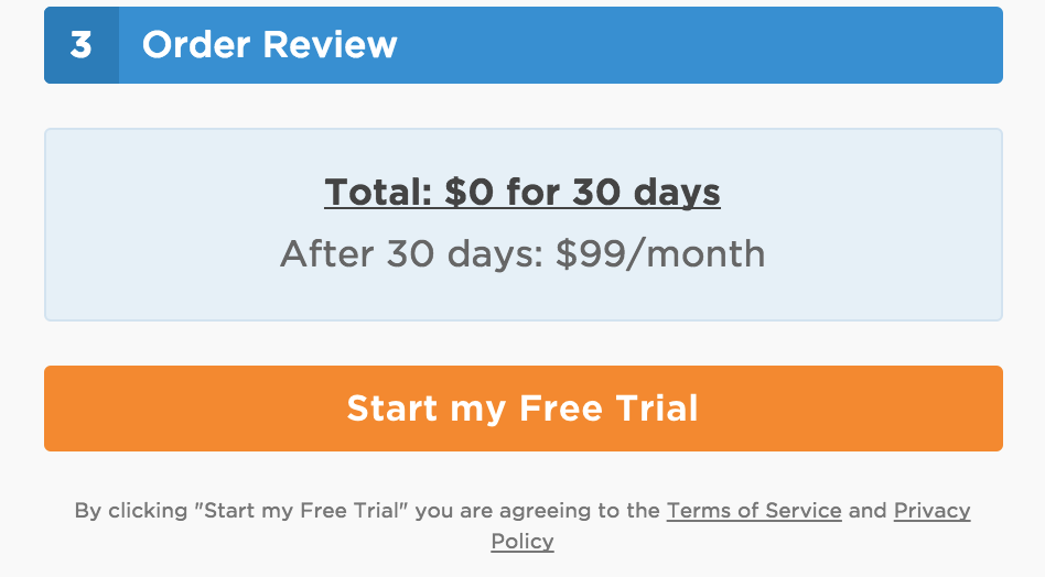
If you give that info, I presume your free trial actually starts. At this point, you’ll have clicked 4 buttons that would have you believe that you’re about to start doing the thing you want to be doing.
You might think this is exactly like Bounce Exchange’s multi-step flow, but it’s not. Bounce Exchange managed expectations quite well throughout the different steps. Unbounce had me click 3 buttons that specifically said I’d get to start building landing pages before that was true.
This approach takes some moxy. You’ve got to be confident that your visitors understand that your solution is valuable enough to warrant jumping through these hoops. Going back to the espresso in Paris example, you could get people to juggle bowling pins before serving up the best espresso if it was widely regarded as THE best by all people in the know.
For Unbounce, this is probably true – they are the best.
For the rest of us, I’d stick to the simple formula:
- Headline makes a relevant promise to your prospects
- Button acts as a door between the promise and the thing promised
- Immediately on the other side of the button is the thing promised
Discussion
I’d love to know if this post helped you evaluate your own website’s headlines, buttons, and timely delivery on the headline’s promise. Are you going to make any changes to test? Share those changes and even results in the comments below!